16 Healthcare Website Examples for Clinics & Medical Practices

We’ve designed dozens of medical websites; and starting from a blank page never gets easier. Web elements, design concepts, SEO… there’s a lot riding on getting it right.
That’s why we put together this list of 16 healthcare website examples, for your reference as a comprehensive medical website design guide covering what to look out for and include for healthcare web design.
For each example, we’ve added pointers on the design choices to help round out your understanding.
1. United Dental Surgery
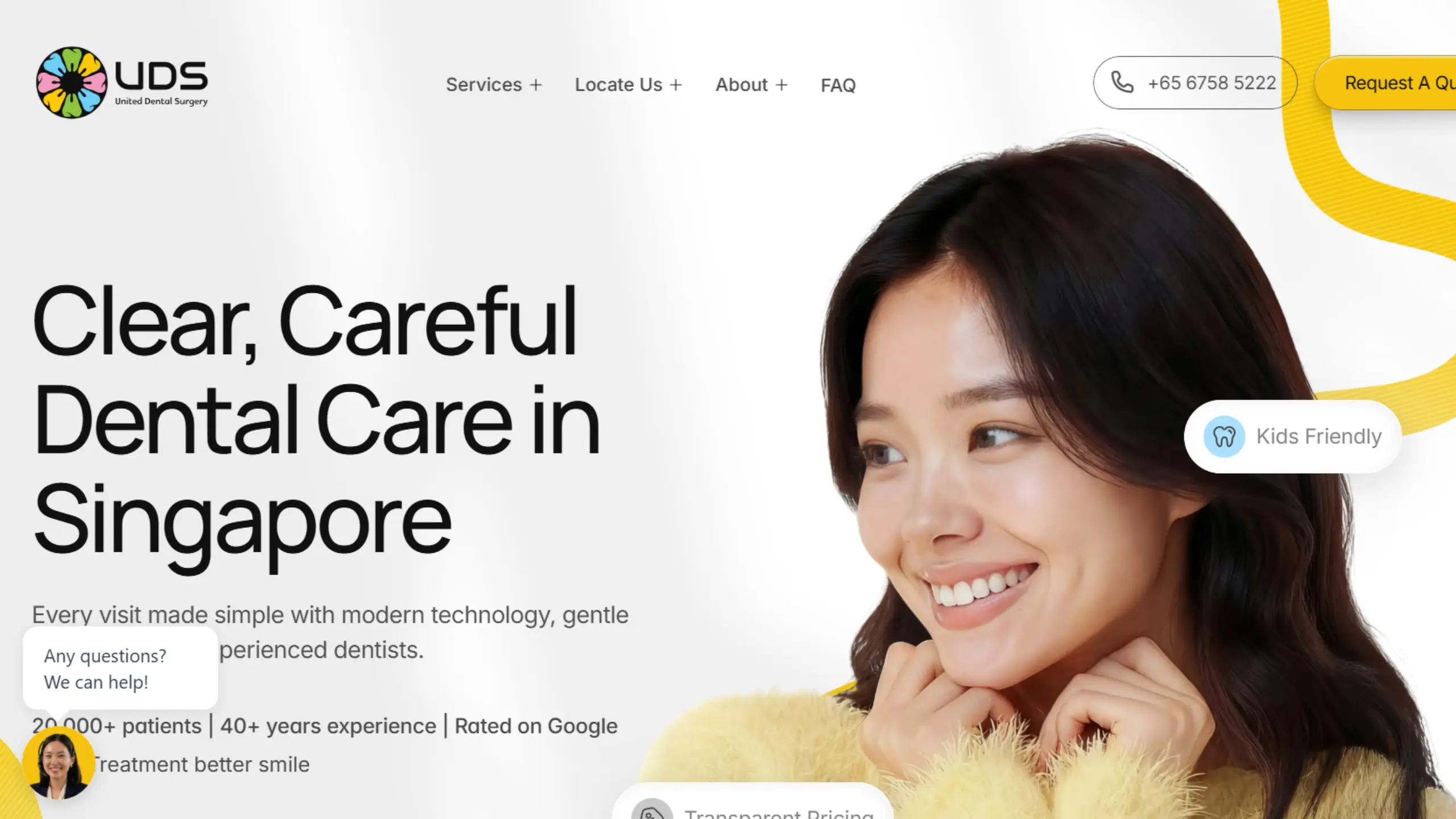
The Concept: United Dental Surgery’s website feels like a modern take on a dentist’s website. It feels clean and highly interactive, with a ton of animations, tabs, carousels, and hover effects.
As a neighbourhood clinic, the UDS website needs to instantly hit the right notes on factors such as price transparency, care for all ages, and dental benefits such as CHAS & Medisave, which it does well.
What to look out for: Notice their service sliders, which display their full range of dental services to prospects. When a dental clinic has well-built service pages targeting effective keywords, it helps them appear in Google search results for dental services in their area.
This is, of course, provided they’ve optimized their website for local SEO and written their SEO content in a way that’s engaging and helpful.
What we would improve: When looking through their service pages, we noticed that most of them are a bit “thin”. This is frequently the problem with maintaining a ton of service pages, as it’s time-consuming to do so.
For dental SEO service pages, it’s best if each webpage is comprehensive, with unique content, selling points, and other key information. Helps readers stay on the page and also signals to Google that your page content is useful.
2. Klinik Caring
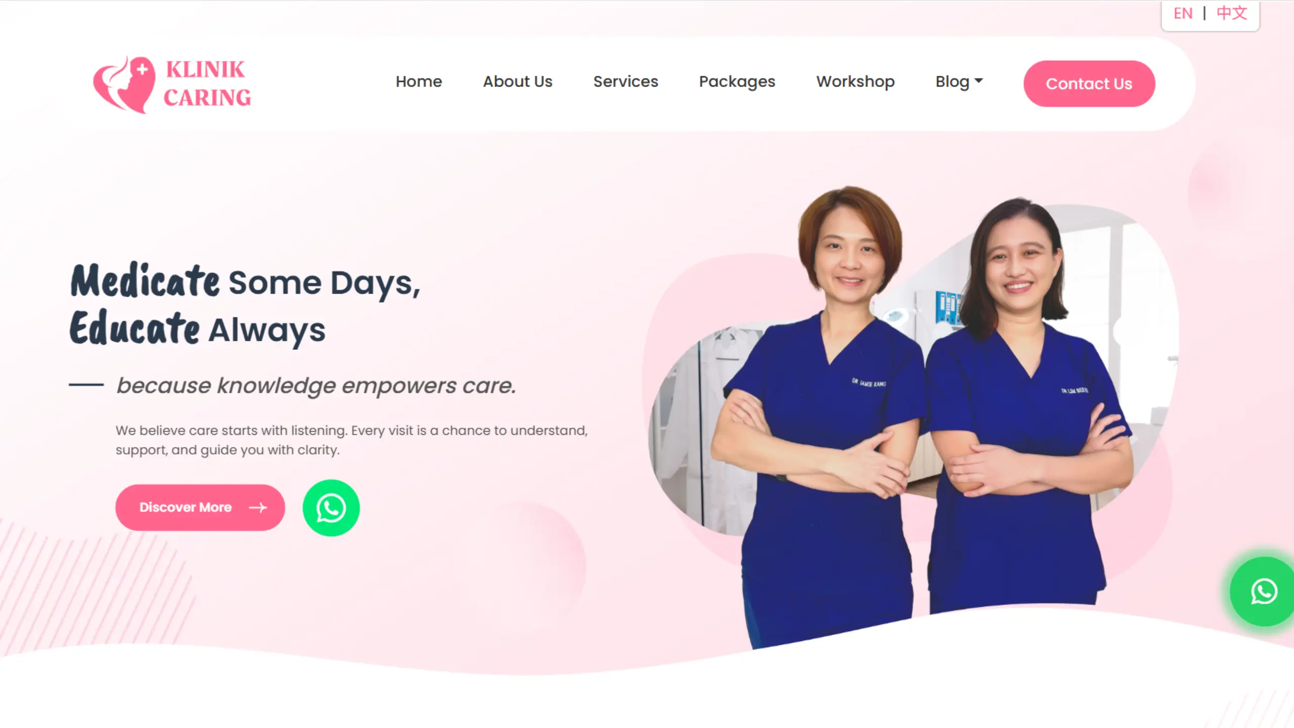
The Concept: Klinik Caring is a women & children’s health practice serving patients out of Johor Bahru. It embraces a cutesy and heartfelt web design concept that puts patients at ease.
Everything from the web elements to the header/footer and cards utilises a rounded design, which makes the whole website feel friendlier and less intimidating.
What to look out for: For Klinik Caring, their website copy stands out. Most medical practices list information in a business-like manner, but Klinik Caring takes the effort to craft the web copy in a way that speaks to the heart, dissolving any concerns that patients might have.
What we would improve: Klinik Caring’s website is so warm and personable, we would recommend adding more images and galleries of its clinic, staff, & doctors, to put faces to the names.
This gives patients a feel of what to expect, which would help them be even more comfortable reaching out.
3. Cove Aesthetic Clinic
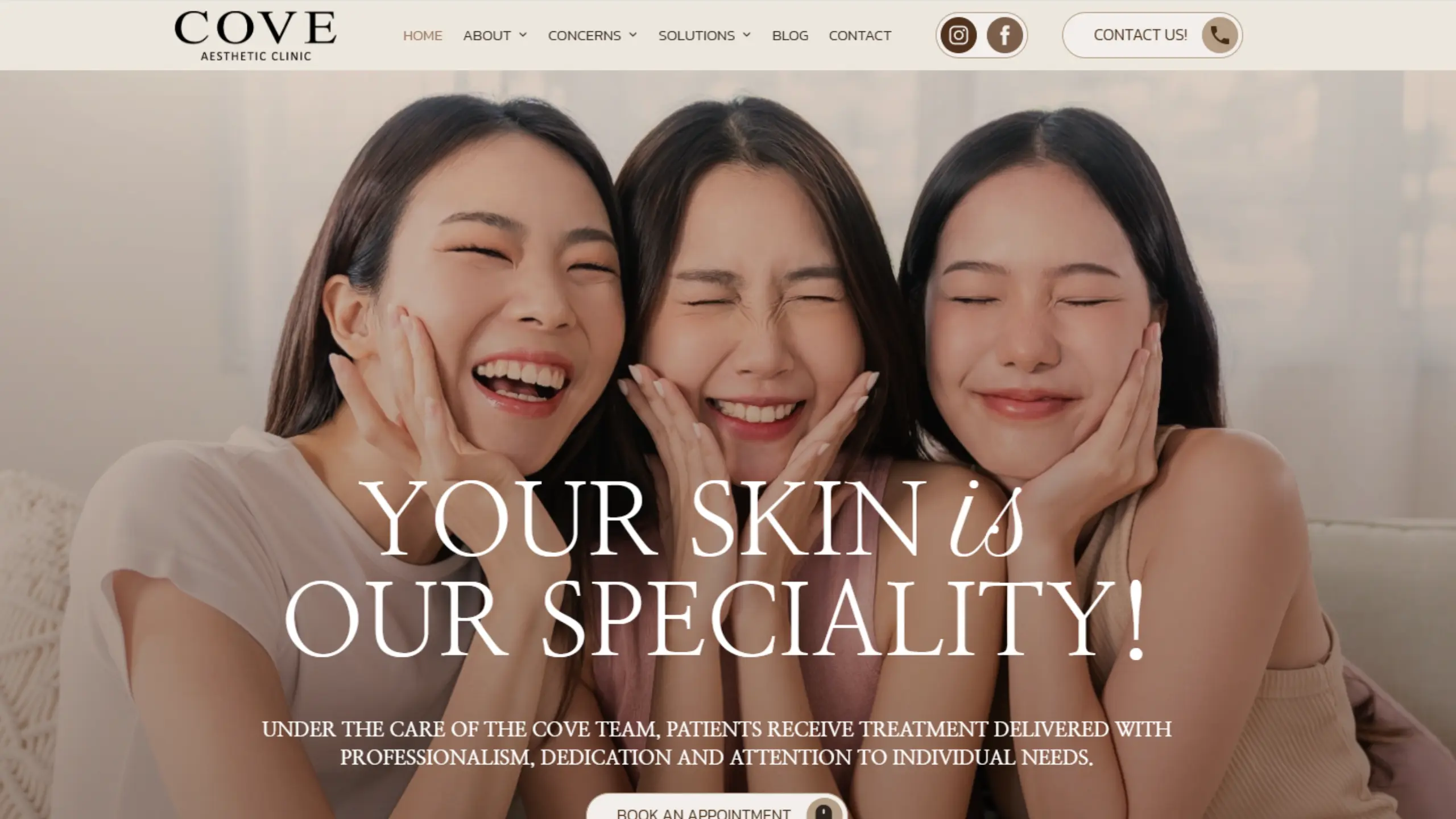
The Concept: Cove Aesthetics’ website embodies a luxury feel, with their chosen fonts, brand colours, and even web copy all working together to deliver that polished vibe.
Very aligned with their positioning as a boutique medical and laser aesthetic clinic in the city, that leans toward comprehensive and customized Korean treatments and technologies.
What to look out for: For Cove, we feel that their media images are their strong point. An attractive hero banner combined with a set of realistic and engaging images of the team at their craft helps the aesthetic practice boost their online presence.
Check out their “Concerns” & “Service” pages as well; very comprehensive and goes into deep detail on how each treatment works, the process, and what to expect.
Such service pages are a great example of aesthetic clinic & practice SEO done right.
What we would improve: Because the website only uses one colour, when scrolling through, it’s hard for the reader to notice any difference between each of the info sections.
This means that it’s harder to catch their attention for details such as new treatments, key information, and contact details, unless the reader does a double-take.
We normally recommend utilising at least two different colours for website styling; this allows the client to drive reader attention to key info by styling elements with appropriate colours.
4. Trinity Women’s Specialists
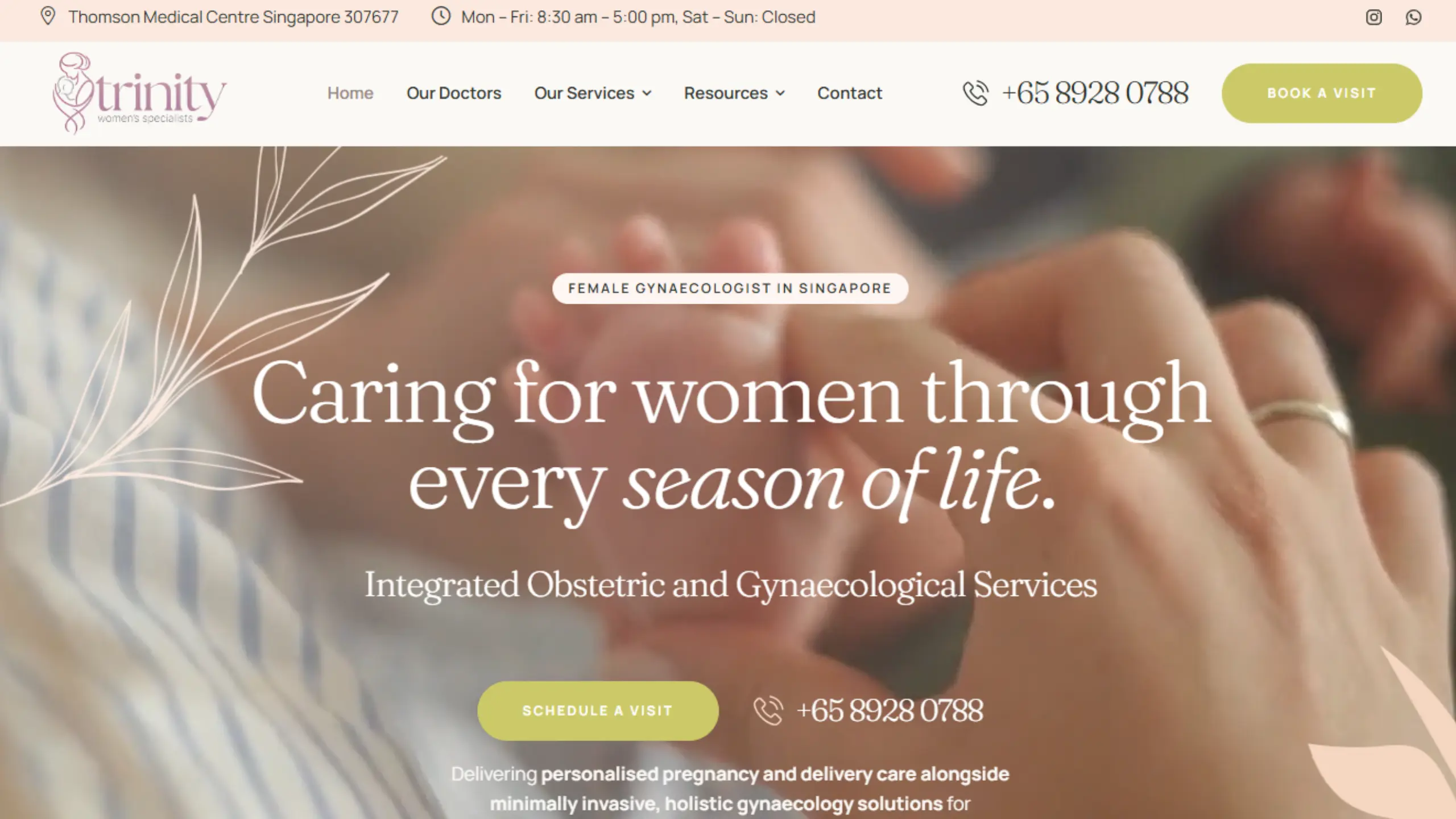
The Concept: Trinity Women’s Specialist clinic offers Obstetric and Gynaecological Services for women across every stage of life. The website is designed with a delicate and tender, yet classy vibe, fitting its target audience for private healthcare.
The website positions Dr Samantha as the “hero,” showcasing her experience and personalised approach to care. Pretty much all website details revolve around her.
What to look out for: The website strikes a great balance between core colours of white and peach, along with accents like lavender and sage. Colours complement each other to deliver a medical web design that’s both intriguing and mesmerising.
Dr Samantha’s profile page is also extremely detailed, listing everything from her professional experience, publications, awards, and memberships. This allows for easy reading for potential leads, and for Google to pull the data required for medical SEO.
What we would improve: Dr Samantha’s profile page would actually benefit from structured data implementation, where details of her achievements and work experience can be compiled for easy reference by Google’s algorithms.
This would help improve her presence & accuracy for AI search queries, as well as rich snippet results.
5. The Skin Drs
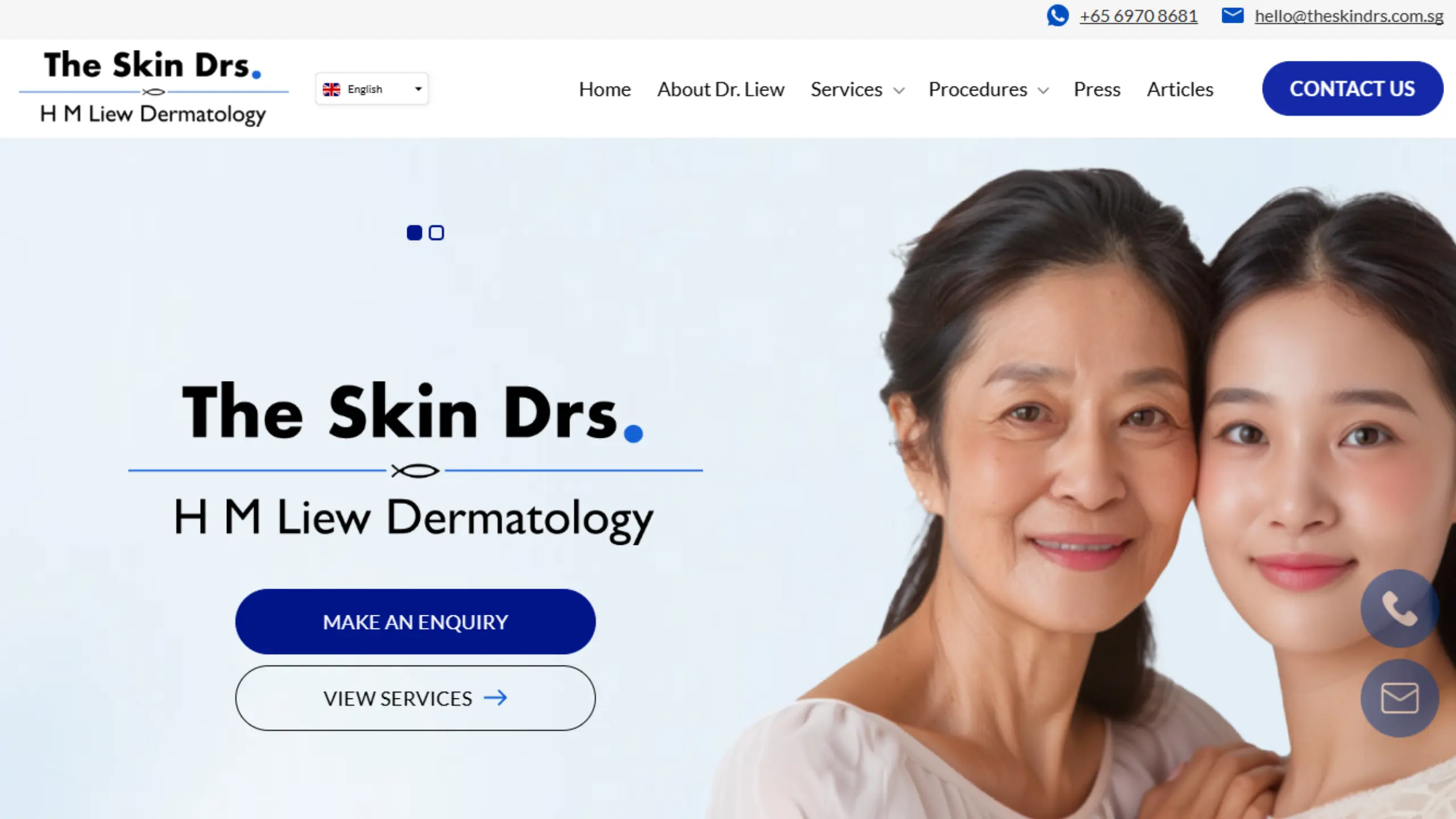
The Concept: This website can be described as leaning towards safer designs (blue and white) and practical web design components that are eye-catching and easy-to-read.
They maintain a huge set of service pages which are extremely comprehensive, covering information such as causes, symptoms, diagnosis, and complications.
What to look out for: The Skin Drs’ website is a great example of conversion-focused design. The site emphasizes eye-catching and highly visible CTA buttons such as WhatsApp, email, and contact forms.
Notice that they do not show before-and-after photos of treatments. This is correct, as under medical advertising regulations, it’s prohibited to do so, in order to avoid creating unrealistic expectations of treatments.
What we would improve: Since before-and-after photos are disallowed, medical practices can try to activate other means of conversion. One that we would recommend is to use videos.
For example, by sharing talking-head videos on their website about skin issues and possible treatments, the practice could build trust with potential patients and encourage bookings to review long-standing skin issues.
6. Expat Dental
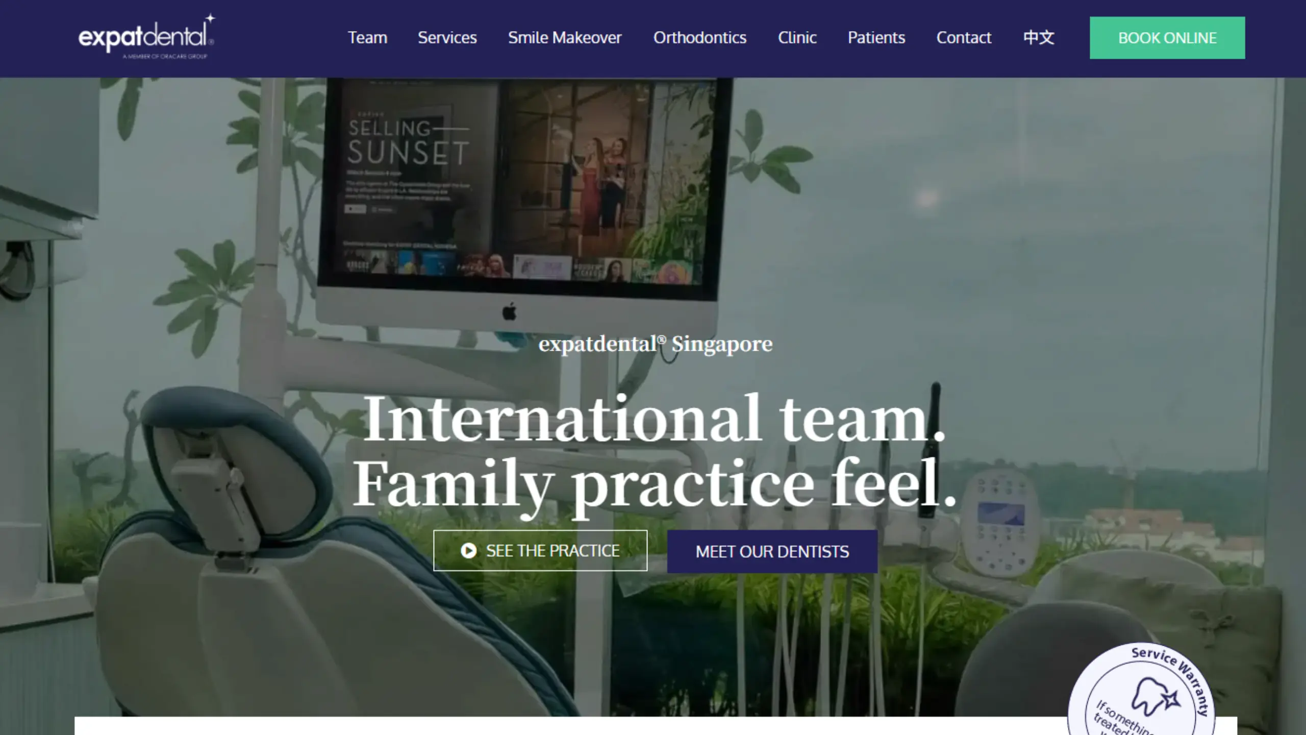
The Concept: It’s not hard to tell who Expat Dental’s ideal customers are. From the hero banner to the media assets and partners, everything is tailored to speak directly to the expat community.
Expat Dental’s website focuses a lot on showcasing their clinic’s bright and welcoming interior. Furthermore, most of the site videos include snippets of the team’s day-to-day work, handling patients in a friendly and cheerful way.
What to look out for: Expat Dental’s website is a great example of how to position your medical practice for your ideal customers. From the media assets to the web copy, everything has to be thought through and consistent with who you’re trying to attract.
Apart from expats, the dental practice also clearly targets leads who are looking for child-friendly features and an emphasis on comfort and bespoke services.
What we would improve: As this dental practice focuses on expats, it might be a good idea to include a translation plugin for other languages such as French or Spanish.
7. Singapore Physio Spine & Pelvis Clinic
View the Singapore Physio Website
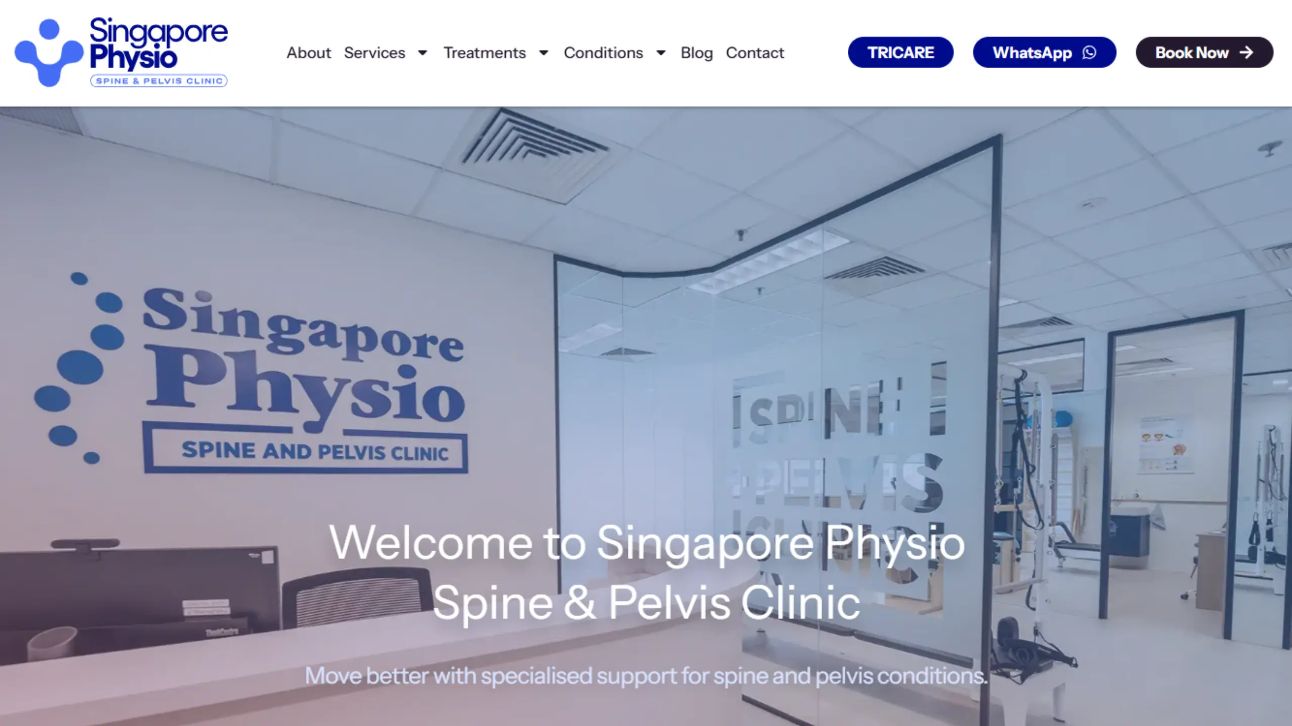
The Concept: The website showcases the physiotherapy practice’s position as a professional and bespoke service provider. They fall back on safer colours and time-tested web components for clarity.
What to look out for: We appreciate their service and treatment cards, where every card is accompanied by a descriptive image of the team actually at work. It’s something different that we rarely see.
What we would improve: Everything looks great, but all their blog posts use a placeholder graphic design image. There’s a concept in SEO called CTR, which measures the rate at which readers tend to click on a post or link.
For medical and healthcare websites, having a descriptive image for blog posts actually helps increase CTR, which in turn supports SEO efforts.
8. GastroClinic
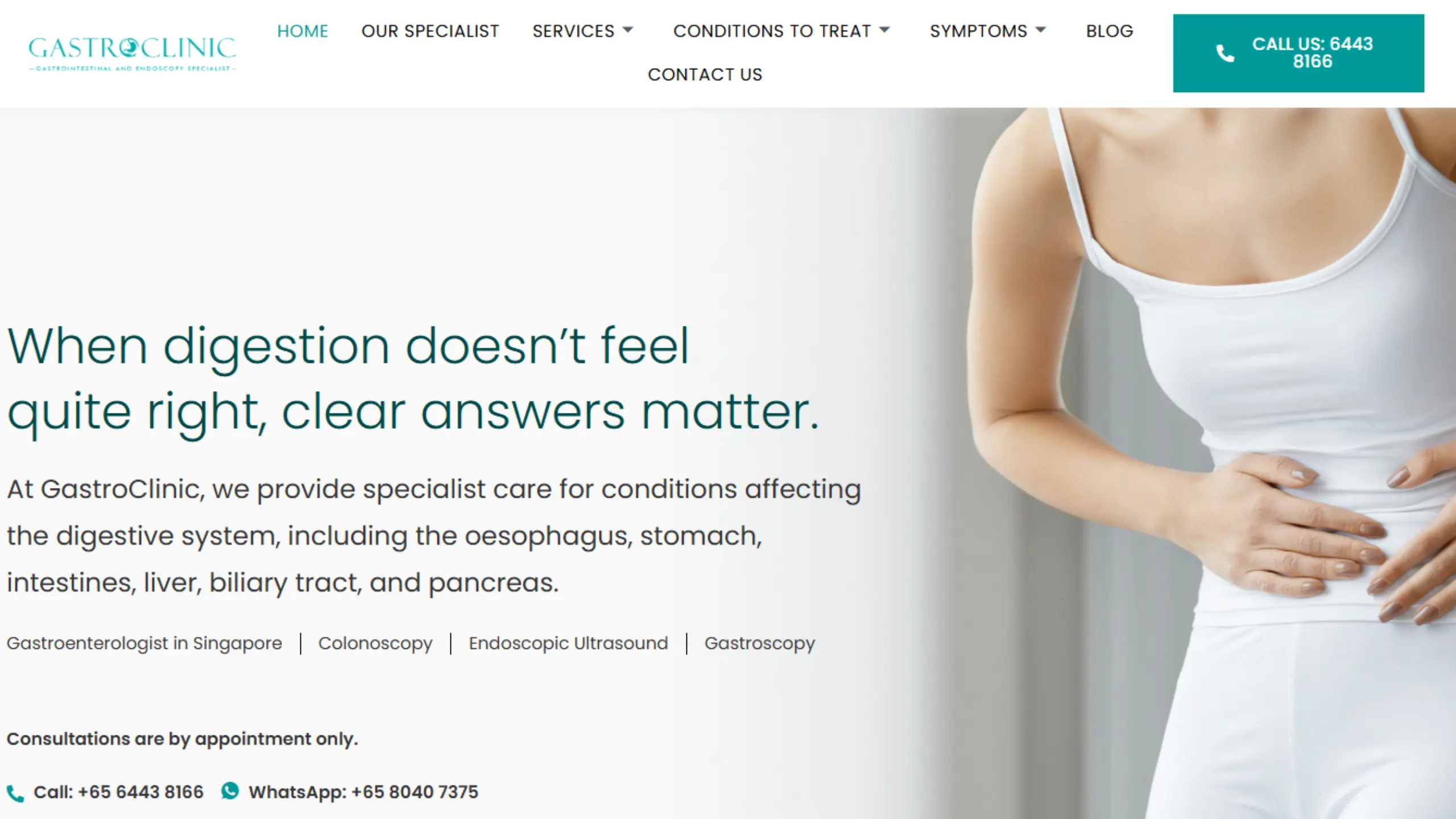
The Concept: What we would consider a more “refined” web design concept, the GastroClinic website catches the eye with a rounded & geometric typeface that feels professional yet approachable.
An accurate mix of images rounds out the design; it looks approachable, but quite clinical nonetheless.
What to look out for: If you view the site in mobile view, you’d see the CTA bar at the bottom. Note that there are options for email, call, and WhatsApp, whichever method the patient prefers.
When we talk about lead generation on your clinic’s website, it’s important to have a variety of options, as not everyone may prefer to contact you via WhatsApp. Some may want a contact form or email instead.
What we would improve: The website looks very clean and clear, but it’s quite clinical. If we could add a second colour, like a sienna orange or blush pink, that would really elevate the medical web design.
Another way to enhance the healthcare practice’s web design is to pair two mildly contrasting typefaces, which can pique reader interest even more.

Get a helping hand with your medical web design.
9. GutCare
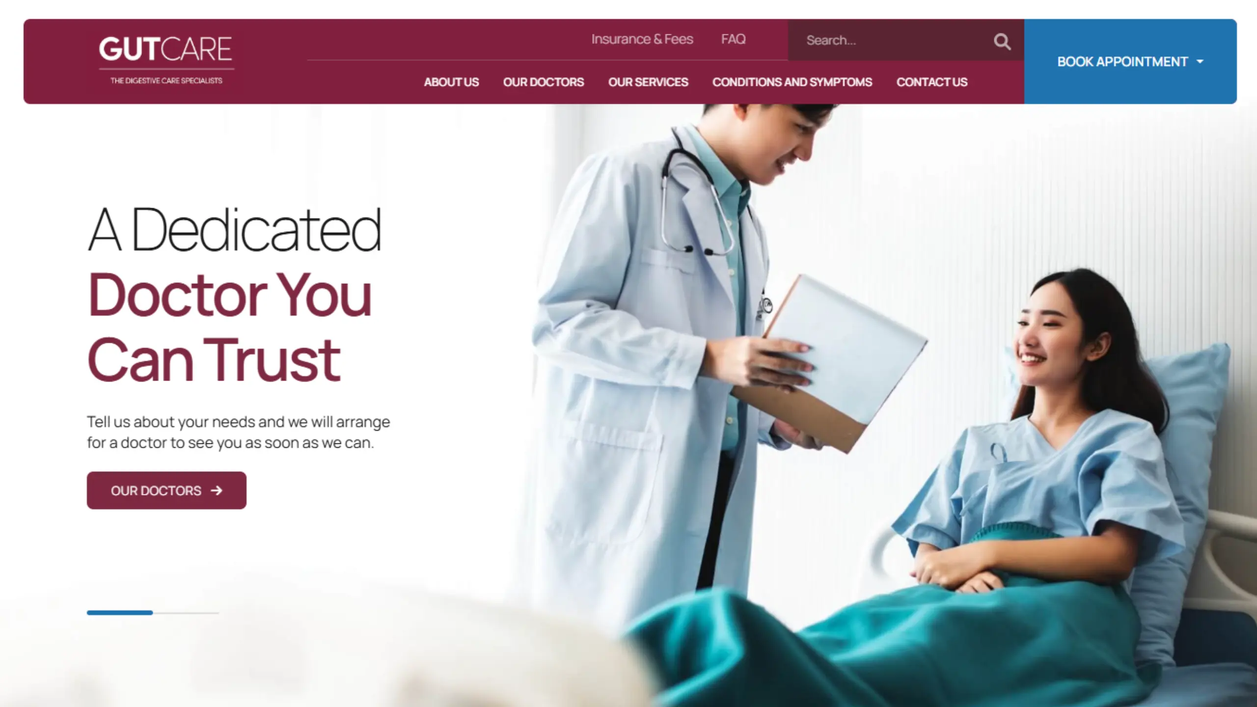
The Concept: There’s a lot happening on the GutCare website. Every component is quite compressed, with little padding between each other.
The good thing is that the overall message is still clear; the site’s designed components, such as the dual font for headers and images, are well-executed.
What to look out for: We admire the website header. It’s very comprehensive and displays a lot of relevant information in a clear and easy-to-read way. Everything from symptoms to treatments, to insurance and fees, is covered well.
What we would improve: For a medical website, the hero banner image could do better; it’s blurry and the ratio is off on mobile. A better first impression could be made here.
10. SBCC Children & Women’s Clinic
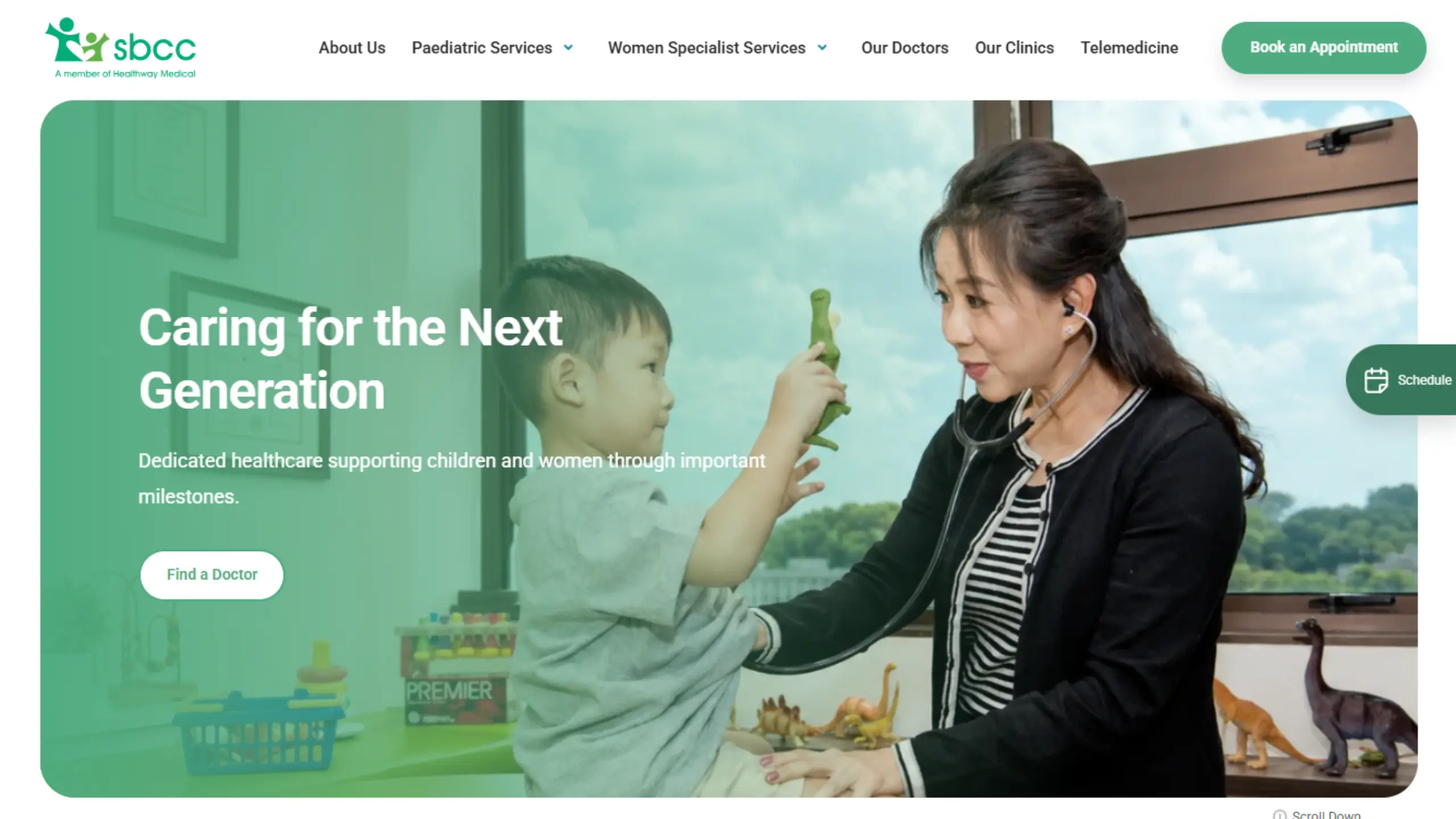
The Concept: SBCC uses a classic bento box web design, which broadly incorporates rounded components that give a softer and approachable feel to the site. This is further accentuated by the use of green colours.
What to look out for: Check out their doctor profile pages; each one is equipped with a personal video to build trust and support conversion.
What we would improve: When we scrutinise the website images, some of them look a bit off. As a local healthcare practice, it’s better if authentic and higher-quality images are used.
Right now, the vibe the site gives off feels more corporate; which may not be what a concerned patient is looking for.
11. Paediatrics & Neuroscience Centre
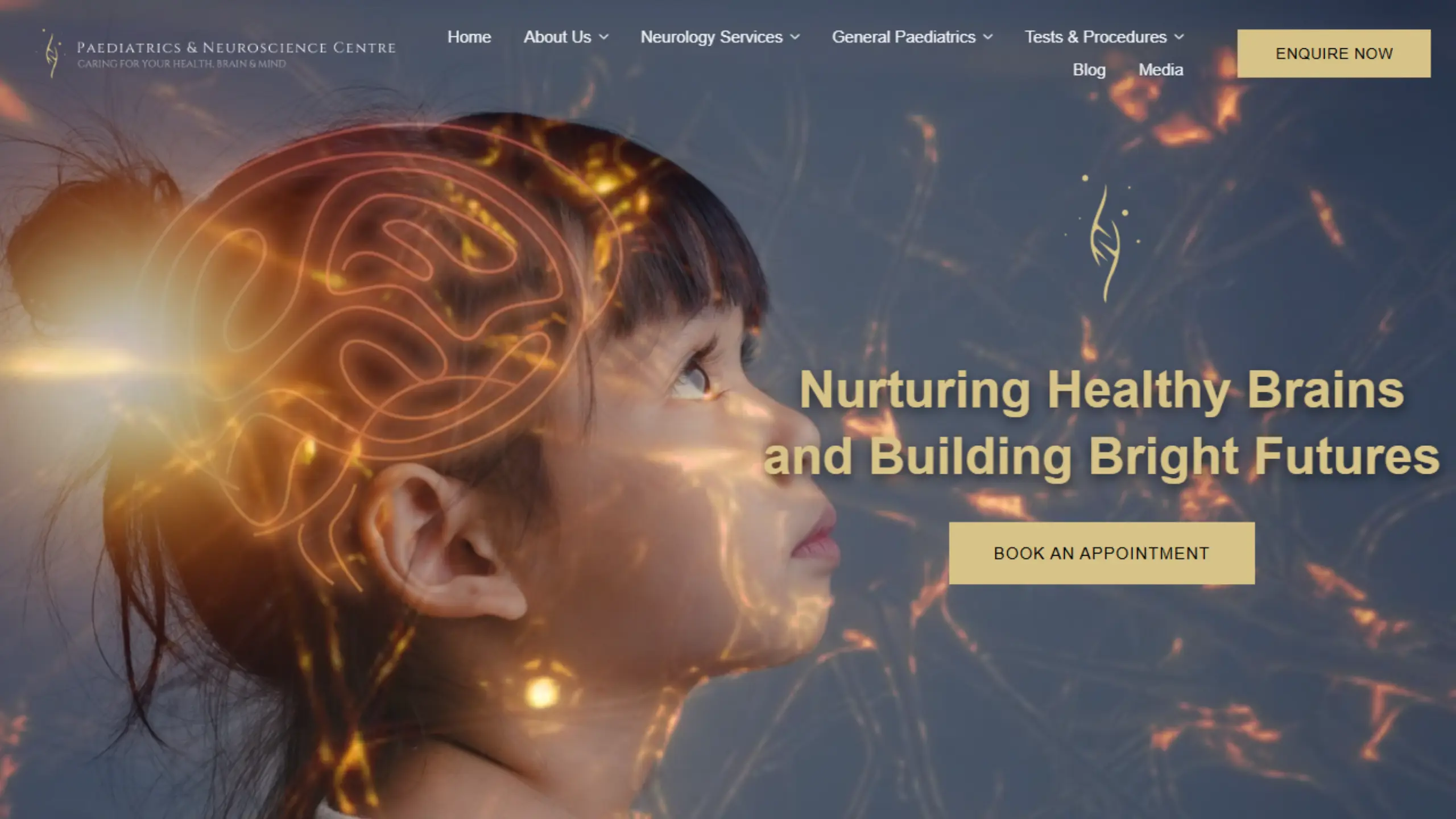
The Concept: Definitely one of the bolder web designs we’ve seen, the site embodies a black and gold palette that drives engagement and interest.
Descriptive images of children position the practice as a dedicated specialist focused on children’s optimal brain health.
What to look out for: Most medical websites make it a point to showcase the doctors, but check out the “About Us” segment, where the nurses are also introduced.
What we would improve: The website has options for patients to WhatsApp or call the clinic, but for a medical website, we would further improve this by incorporating a booking system.
This helps secure more patients, as they could do self-service bookings instead of going through the to-and-fro of trying to make an appointment.
12. Oxford Spine & Neurosurgery
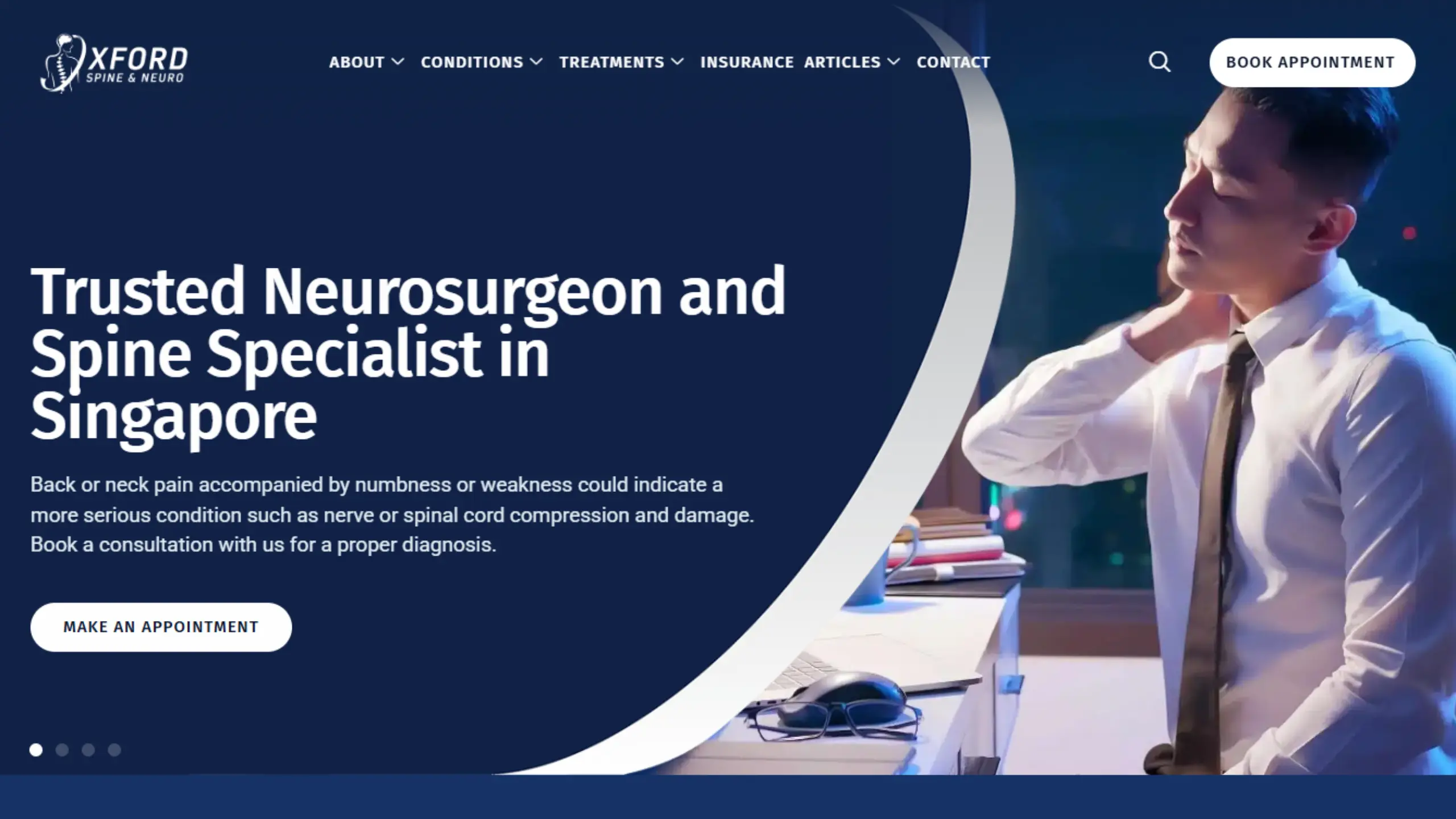
The Concept: Another bold concept where a dark navy colour is used as the main canvas, while medium blues and greys are applied to contrast.
Dark palettes give the medical website more character and authority, reinforcing a sense of expertise and seriousness fitting for a neurosurgery practice.
What to look out for: Clinics rarely integrate social media content on their homepage, but you see this on Oxford Spine’s website.
This helps patients bridge the connection between the practice and its socials, while also improving conversion rates, as patients can flow between both entities to understand more about the offerings and team.
What we would improve: Although two sets of theme colours are in use, pairing a dark with a medium blue induces a degree of limitation with visual design.
This makes it hard to craft focus points for patients to notice.
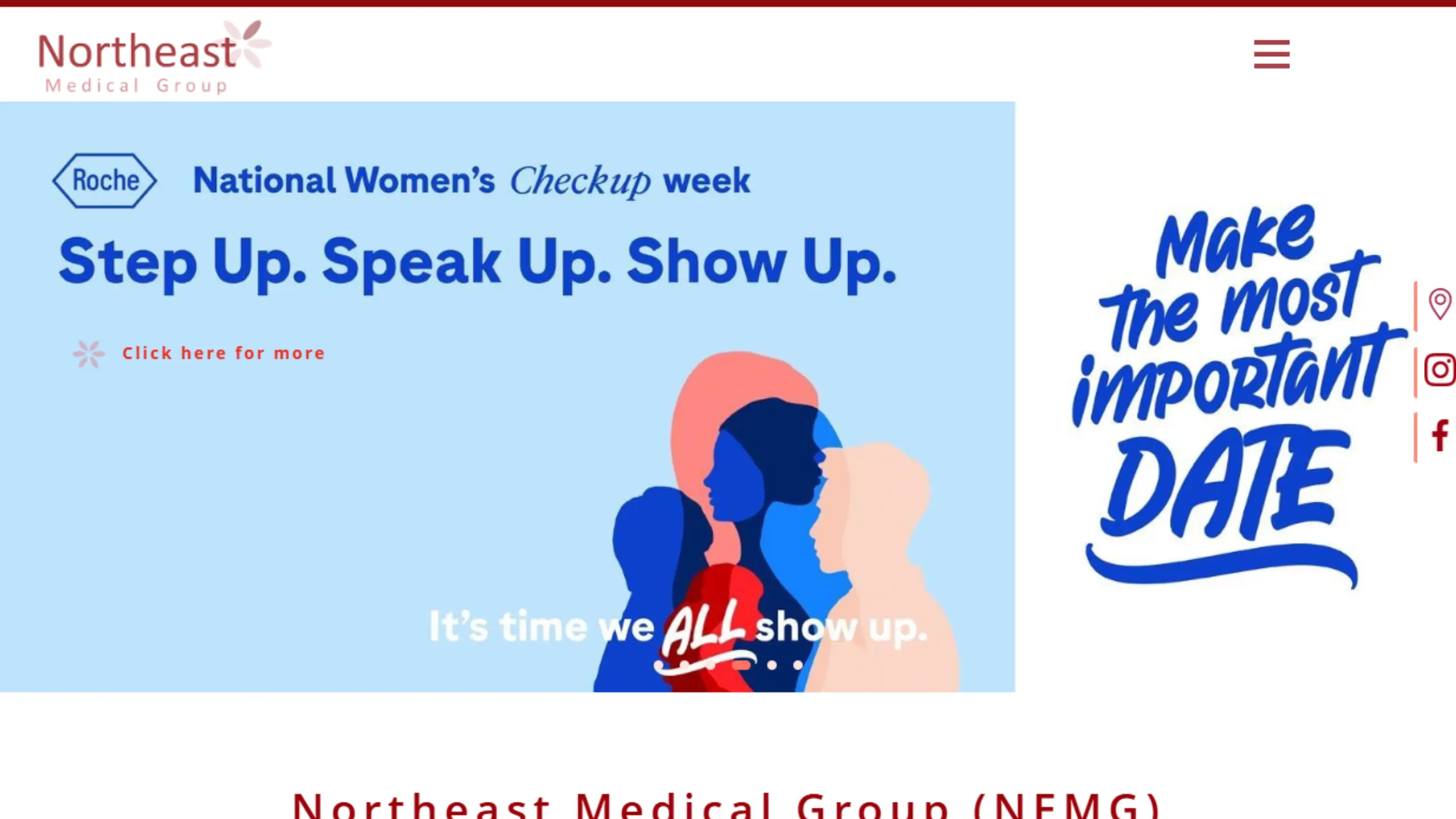
13. Northeast Medical Group
View the Northeast Medical Website
The Concept: For healthcare web designers who are into more cartoonish or anime-esque theme designs, this is a really nice example.
As a local GP clinic, the website makes effective use of illustrations to invoke a friendlier and more comforting feel for its patients.
What to look out for: The website expertly pairs cartoonish illustrations with actual images and a warm red colour, producing a visual feel that’s delightful to navigate.
What we would improve: As a local GP clinic catering to everyday Singaporeans, pricing and insurance feasibility are very important.
We would introduce a dedicated “Pricing” and “Insurance” page where basic service costs could be displayed. This gives potential patients more peace of mind when reaching out.
14. St Luke’s Hospital
View the St Luke’s Hospital Website
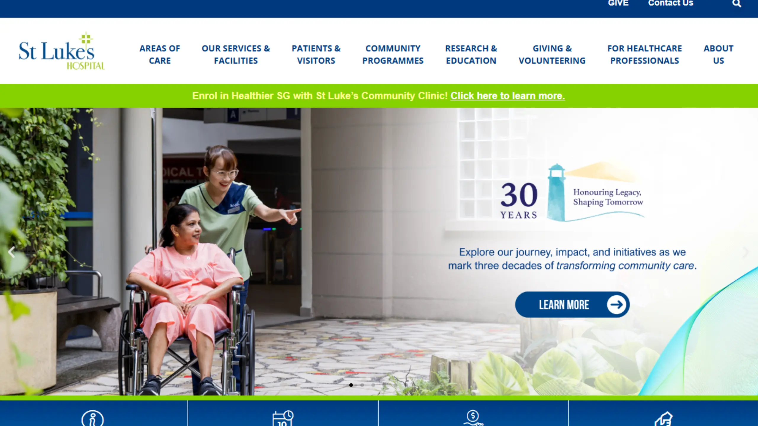
The Concept: St Luke’s is a community care hospital in Singapore. The website concept comes across as authentic, professional, and clear.
The website leans heavily on real images of the team in action, serving patients. Royal blue and Kelly green pair well here, crafting a memorable impression.
What to look out for: Review their service pages and you’ll find they are extremely versatile. Everything from strong service banner images, videos, tickers, and how-it-works sections are involved.
This range of conversion assets helps the hospital attract patients who can choose to view their preferred media format.
What we would improve: For a community hospital with so many services, the header feels quite cramped.
Using a mega menu here would help declutter the navigation, allowing patients to quickly find the specific service or department they’re looking for without feeling overwhelmed.
15. Oriental Remedies Group
View Oriental Remedies Website
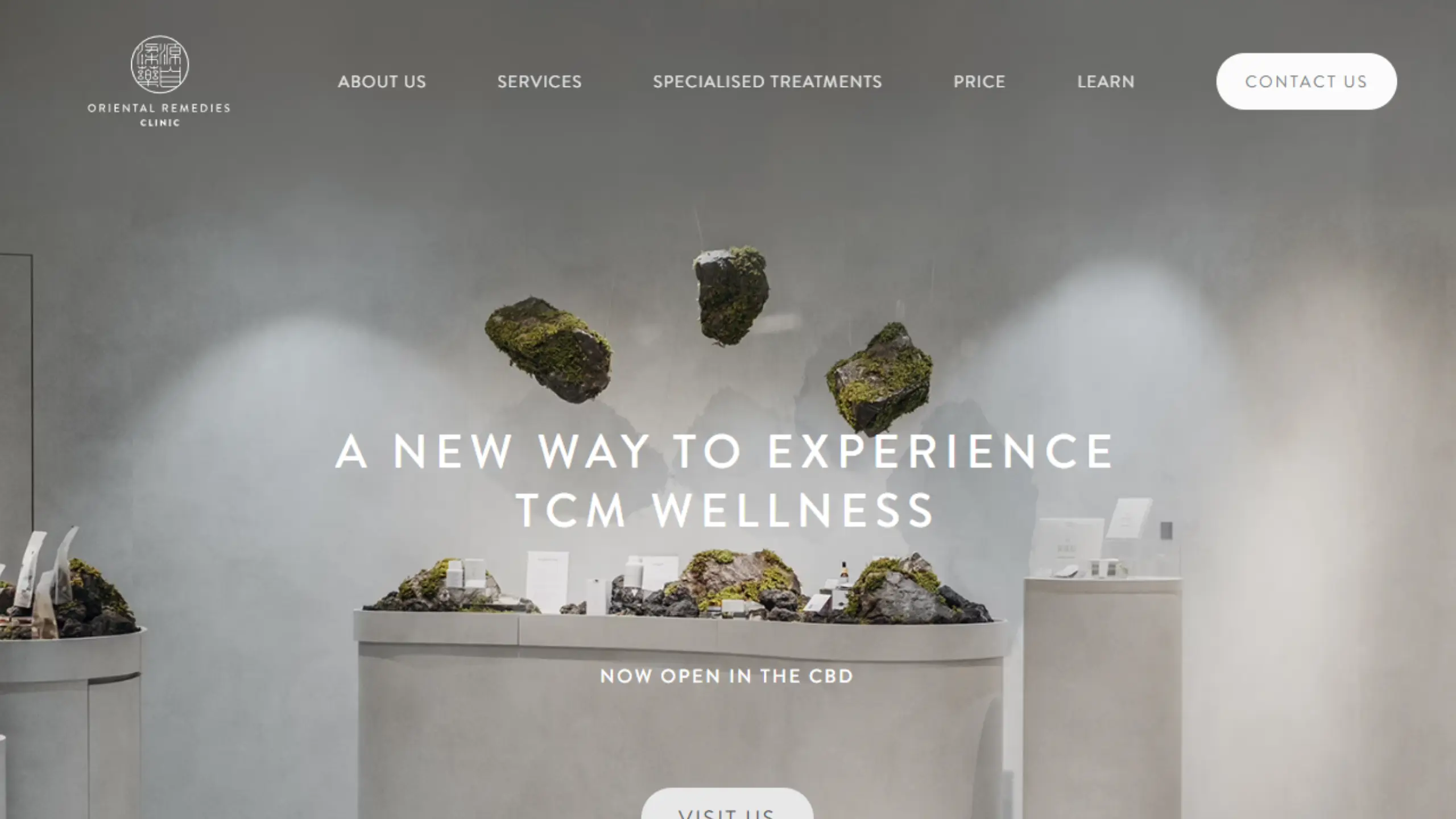
The Concept: For the unaware, Oriental Remedies is a TCM (Traditional Chinese Medicine) chain practice with multiple branches across Singapore.
Their branding is a bit different; they set themselves as a more bespoke and modern TCM practice that is tech-enabled and sophisticated. The web design reflects this with captivating images, grey tones, and more spacing between elements.
What to look out for: Check out their images: clear photos of their team in lab coats with their logo, and aesthetic shots of their clinic’s interiors; a foundational method to communicate your practice’s ICP and brand identity.
What we would improve: We get that the spacing between elements promotes luxury, but for SEO purposes, it’s better for medical practices to add more content for the algorithm to assess.
Adding more creative elements which can be used to display web copy in a list or sub-heading form should improve readability & boost the site’s SEO ranking.
16. S Aesthetics Clinic
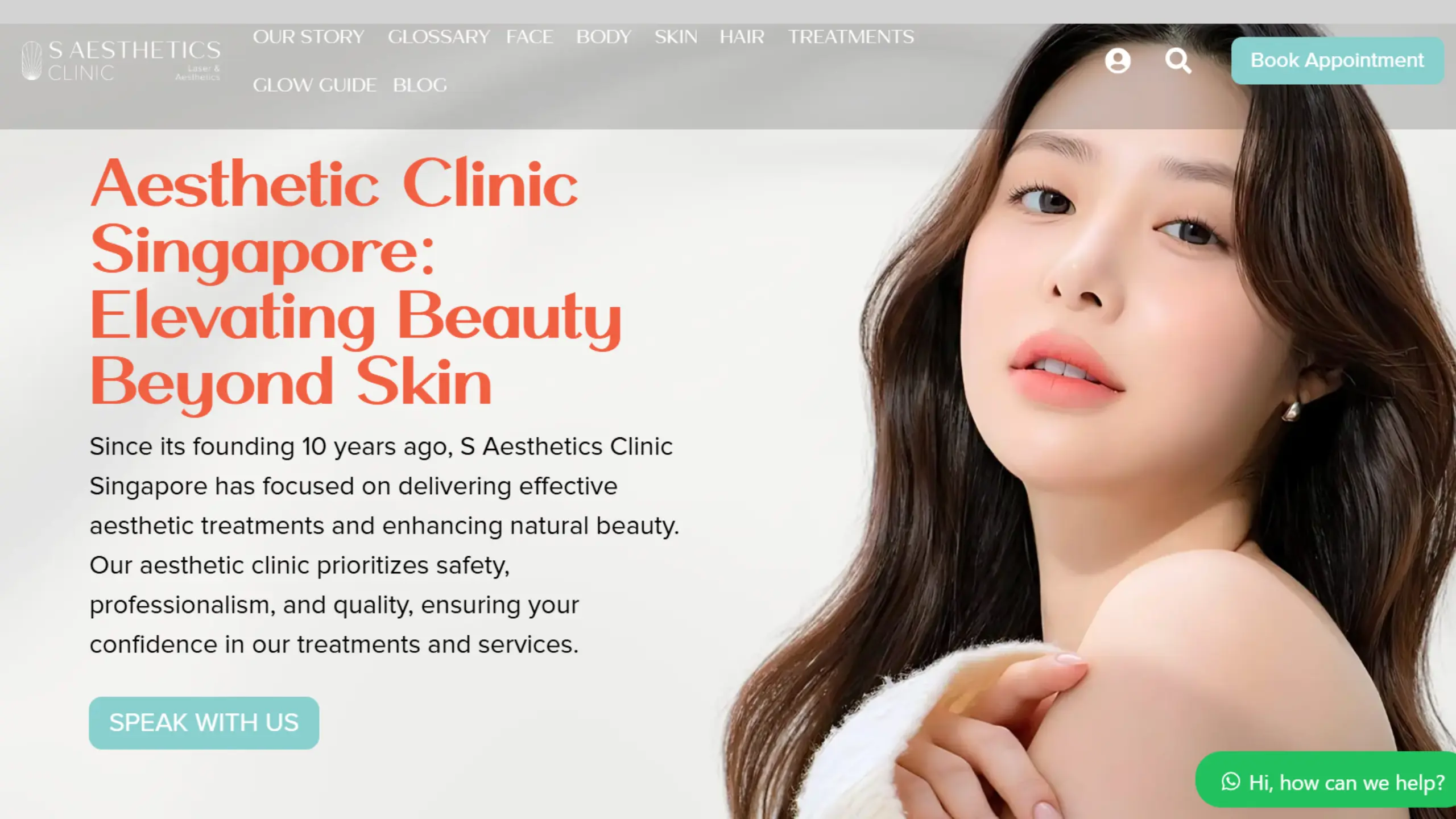
The Concept: Want something unique and don’t wish to play it safe? Check out S Aesthetics’ website. The design concept crafts an energetic visual with vibrant coral and calming teal.
What to look out for: The use of gradients, coloured fonts, and creative images helps the site feel more like a lifestyle brand than a typical aesthetic clinic, speaking to a decidedly younger demographic of patients.
What we would improve: While the bold colours and graphics help the brand stand out, we feel the website could do more to showcase the actual clinic; such as real photos of the interior, treatment rooms, and equipment.
Patients still want reassurance that they’re walking into a professional space, not just a stylish brand. Balancing visual identity with authentic images helps build that trust before a lead even reaches out.

Looking to get some help? At dantiv, we are the leading SEO agency in Singapore for medical and healthcare SEO.
Final Thoughts
There’s no single “right” way to design a healthcare website; what works for a boutique aesthetic clinic won’t necessarily work for a community hospital or a neighbourhood GP.
The best Healthcare website examples are the ones that stay true to who their patients are, while still nailing the fundamentals: clear navigation, trust-building content, strong SEO foundations, and a design that reflects the practice’s personality without compromising on professionalism.
Whether you’re just starting to plan your medical website or looking to give your existing one a refresh, we hope this list gives you plenty of inspiration to draw from; along with a sense of what to look out for, and what to improve.
Building (or rebuilding) your own healthcare website? Feel free to reach out to us at dantiv; we’re ready to bring your vision to life.