
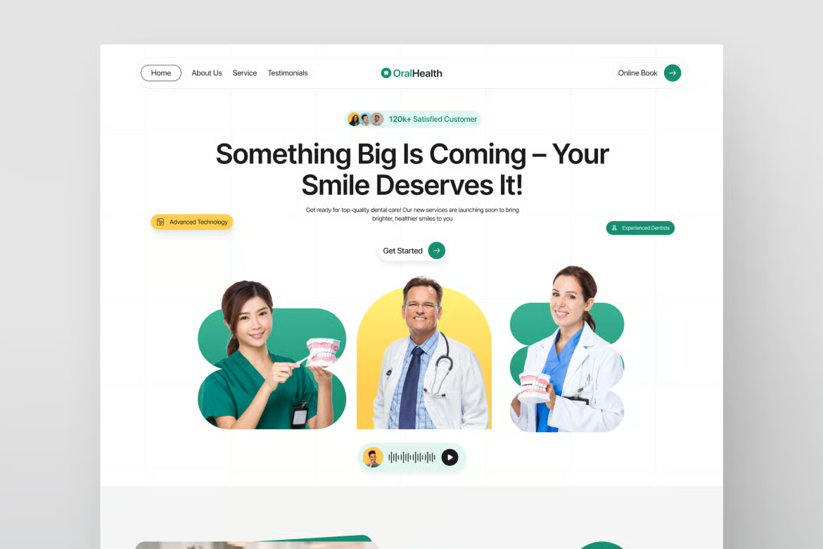
A patient searching for urgent care, a specialist, or a first appointment does not browse like a casual shopper. They are often worried, short on time, and trying to answer a few basic questions fast: Can this clinic help me? Is it nearby? Does it take my insurance? How do I book?
To reduce clinic website bounce, your site needs to answer those questions before visitors feel any uncertainty. This is not about trapping people on a page with flashy design. It is about removing friction, proving credibility, and giving every visitor a clear next step.
A bounce rate alone can be misleading. Someone who lands on a location page, sees your phone number, calls the clinic, and leaves has still had a successful visit. The same is true for a patient who finds office hours or gets directions in under a minute.
The issue is high bounce combined with weak business outcomes. If visitors leave quickly and appointment requests, calls, online bookings, and form completions are low, there is work to do. Look at behavior by channel and page rather than treating the entire site as one number.
Paid search visitors may bounce because an ad promised a specific service that the landing page barely mentions. Organic visitors may leave because your page ranks for a broad question but gives a thin answer. Mobile visitors may be dealing with slow load times, tiny buttons, or a booking form that is painful to complete on a phone.
Track engaged sessions alongside conversion actions. For most clinics, the actions that matter are booked appointments, call clicks, form submissions, insurance checks, direction requests, and chat conversations. A lower bounce rate is useful only when it supports more qualified patient inquiries.
The top of a clinic page has one job: orient the patient immediately. Within a few seconds, they should know what care you provide, who it is for, where you are, and what to do next.
Generic claims such as quality care you can trust do not carry enough weight on their own. They could describe any practice. A stronger opening is specific: pediatric dental care in Austin, same-day treatment for minor injuries in Phoenix, or physical therapy for runners and active adults in Seattle.
Put your primary booking action where it can be seen without scrolling. Depending on your clinic, that may be Book an Appointment, Call Now, Request a Consultation, or Find a Location. Do not make visitors hunt through a menu to take the action that pays for the website.
This does not mean every page needs the same hard sell. An article about post-operative recovery may need a gentler next step, such as Speak With Our Care Team. A service page for cosmetic dentistry can support a more direct consultation request. The right call to action depends on the patient’s level of urgency and readiness.
A visitor who searches for an urgent care clinic near me needs hours, location, accepted insurance, wait-time information if available, and a prominent call option. They do not need to scroll through a long history of the practice first.
A visitor researching treatment for chronic back pain needs more explanation. They may want to understand symptoms treated, the clinicians involved, what an initial visit looks like, and whether a referral is required. Give them enough detail to feel informed, then make the next action simple.
One page cannot serve every type of visitor equally well. Build focused service, provider, location, and condition pages where there is real demand. This gives patients a more relevant experience and gives your marketing campaigns a better destination than the homepage.
For many clinics, mobile is the first and sometimes only touchpoint before a patient calls or books. A desktop-first site that merely shrinks to fit a phone will lose people.
Test your site on an actual phone, not only in a browser preview. Can someone tap the phone number without zooming? Is the appointment button visible? Does the form require too much typing? Are dropdowns usable? Does a calendar tool load quickly enough to keep attention?
Booking tools are a common weak point. They can be necessary, especially when schedules are complex, but they may also add slow scripts, confusing handoffs, or too many fields. If your booking platform cannot be simplified, offer a second route such as a click-to-call button or a short request form.
Ask for only what your team needs to respond. Name, phone number, email, preferred location, and reason for visit may be enough for an initial inquiry. Every extra question creates a reason to abandon the form. For protected health information, follow your legal and privacy requirements rather than collecting clinical details unnecessarily through a standard website form.
Healthcare decisions carry more perceived risk than ordering a product online. Patients want evidence that the clinic is legitimate, competent, and a good fit for their situation.
Trust signals work best when they are specific and placed near the decision point. Show clinician names, credentials, professional photos, areas of focus, patient reviews, insurance information, affiliations where relevant, and clear contact details. A real clinic address and a consistently displayed phone number matter more than stock photos of people in lab coats.
Reviews should support the page, not dominate it. A short, credible patient comment beside a booking prompt can reduce hesitation. Avoid overloading every page with repeated testimonials or badges. Too much visual noise can make a medical site feel less credible, not more.
Provider pages deserve particular attention. Patients often search a clinician’s name after receiving a referral, seeing an ad, or hearing a recommendation. A thin biography page with no specialty information, photo, availability guidance, or booking route is a missed opportunity.
A slow website communicates the wrong thing before anyone reads a word. Patients may not know why a page drags, but they will associate the experience with disorganization and move to another option.
Start with the pages that receive the most traffic and the most paid-media clicks. Large uncompressed images, autoplay videos, excessive animation, bloated themes, and too many third-party scripts are frequent causes of slow clinic websites. Chat widgets, tracking tools, review feeds, and booking integrations each have a purpose, but together they can become expensive in page speed.
The answer is not to remove every useful tool. It is to decide what earns its place. If a tool produces meaningful calls or bookings, keep it and optimize around it. If no one uses it, do not let it slow down the patient journey.
Technical cleanup also includes broken buttons, outdated physician information, misleading office hours, and pages that return errors. These are small details with a large trust cost. A monthly maintenance process catches issues before they turn into lost appointments.
Sending every visitor from Google Ads, social ads, local listings, and email campaigns to the homepage is convenient for the marketing team but rarely best for conversion.
A campaign for dental implants should lead to a focused implant page. A campaign promoting sports physicals should lead to the relevant service page with eligibility, location, timing, and booking details. The message in the ad, the headline on the page, and the action you ask visitors to take should line up.
This is especially important for local clinics with several locations or service lines. A patient looking for a clinic in one neighborhood should not arrive on a generic corporate page and have to figure out where you practice. Make location selection obvious, then carry the local address, hours, map details, and contact path through the experience.
Website changes can become subjective quickly. One person prefers a large hero image. Another wants more copy above the fold. Neither preference matters as much as whether the page generates qualified patient action.
Start with one clear hypothesis at a time. For example, a page may be losing mobile visitors because the booking button appears too far down. Move it higher, track mobile call clicks and booking starts, and compare the result over a meaningful period. Do not redesign the headline, form, images, menu, and offer all at once if you want to know what worked.
Heatmaps, session recordings, form-abandonment data, call tracking, and analytics can reveal where friction appears. Use them with judgment. A small sample can be misleading, and privacy expectations in healthcare should shape how you configure any tracking. The goal is useful behavioral insight, not surveillance.
The clinics that improve fastest treat their website like a front-desk team member: trained, monitored, and improved over time. Start with the pages that receive the most patient traffic, remove one point of uncertainty, and make it easier for the right person to take the next step.