GROW Series Part 5: Best eCommerce Product Page Designs for Conversions
The product page is where conversions are won or lost. It’s the final stop before checkout, where a curious visitor either becomes a paying customer or changes their mind. Yet despite how much traffic and ad spend gets funneled toward this single page, most brands treat it as an afterthought; a simple product photo, a price, and an “Add to Cart” button.
Getting it right is part art, part science. It’s the kind of nuance that only comes from running countless tests and watching real customer behavior over time. In this article, we’re sharing the key concepts we’ve learned from years of hands-on CRO work, so you can apply them to your own product pages and start turning more browsers into buyers.

Conversion Rate Optimization Fundamentals
Before jumping into specific design tactics, it helps to step back and understand what CRO actually is; and why it matters so much for eCommerce. At its core, CRO is the practice of systematically improving your website to guide visitors through the steps in a sales process, whether that’s purchasing a product, signing up, or adding to cart.
For both Shopify & WooCommerce stores, even small improvements in conversion rate compound into significant revenue gains over time, often without spending an extra dollar on traffic. The sections below break down the foundational elements that make CRO work on a product page design level.
Understand your Customer
You can’t optimize for a customer you don’t understand. Before changing the button colors or rewriting a headline, the real work starts with research: who are your likely customers, what are they looking for, and what’s stopping them from buying right now?
This understanding can come from a mix of sources; qualitative insight from customer interviews and support conversations, on-the-ground experience from your sales or service teams, and quantitative data from heatmaps, session recordings, and A/B tests.
With this info, you can apply the right tactics to the right audience. Skip this step, and even the most “proven” design changes can fall flat.
Deliver Sufficient Information
A common mistake of newer eCommerce stores is under-explaining their product. A few bullet points and a short paragraph might feel sufficient, but customers unfamiliar with your brand often have far more questions than that.
Specs, materials, sizing, use cases, what’s included, how it compares to alternatives: every unanswered question is a reason for a customer to leave and search elsewhere.
Thin content might look “clean,” but in eCommerce, clarity beats minimalism. You shouldn’t overwhelm, but you do need to proactively answer questions a hesitant buyer might have before they have to ask.

Customer Reviews, Testimonials, UGC & Case Studies
Nothing builds trust faster than social proof. Reviews, testimonials, user-generated content, and case studies let your customers do the convincing for you. Shoppers are inherently skeptical of brand claims, but far more receptive to the experiences of people just like them.
Strategically placed social proof; near the price, next to key claims, or close to the buy button can directly address objections at the exact moment a customer is deciding whether to trust you.

Visuals and Media
Media assets can do more selling than copy ever could. High-quality product images shot from multiple angles, showing scale, texture, and real-world use can help customers visualize the product & reduce uncertainty that comes with not being able to physically touch it.
Beyond standard product shots, supporting imagery like lifestyle photos, infographics, size charts, and “in-use” shots can answer practical questions at a glance and reinforce the value of what you’re selling.
Incorporate Trust Signals
For newer or lesser-known brands especially, customers are silently asking themselves: “Is this store legitimate?” Trust signals exist to answer that question before it becomes a barrier.
This includes visible business information like contact details, UEN identification and authentic images that the store is active and well-maintained and any third-party validation like press mentions or certifications. Without these signals, even a beautifully designed page can trigger hesitation.
Deliver a Smooth Digital Experience
Great content and design mean little if the experience around them is slow or clunky. Page speed, mobile responsiveness, and smooth interactions all shape how a customer feels about your brand.
A slow-loading page doesn’t just frustrate users; it actively erodes trust and increases bounce rates, no matter how strong your product or copy is. A fast, frictionless experience is essential, it’s the foundation everything else is built on.
Important Elements for your eCommerce Product Page
After building hundreds of eCommerce stores, we’ve found that certain elements show up again and again on the highest-converting product pages. More than trends, we believe they’re the building blocks that consistently help turn interest into purchases.

Strong Media Assets
Your media is often the first thing a customer engages with, so it needs to do real work. Handpick your strongest photos, videos, and UGC to showcase the product from multiple angles; in use, up close, in context, and at scale.
A mix of polished product shots and authentic customer-generated content tends to perform best, since it balances aspiration with credibility. Avoid relying on a single hero image; customers want to explore a product visually before they commit to it.
Include Detailed Descriptions & Information
Customers should never have to guess what they’re buying. Your product description and supporting information need to clearly cover the essentials: key features, use cases, materials, dimensions, weight and quantity, shipping details, payment terms, and usage tips.
Beyond the core details, consider adding supporting content like FAQs, before-and-after comparisons, or simple how-to guides. These extras help address more specific concerns, the kind that don’t fit neatly into a standard description but still influence a customer’s decision to buy.

Feature Cards
Feature cards are secondary, visually distinct sections that highlight a product’s key selling points in more depth. Rather than burying important details in a wall of text, feature cards let you break information into digestible, scannable chunks, pairing icons, short copy, and imagery to spotlight what matters most.
They’re especially useful for reinforcing differentiators (like materials, certifications, or unique functionality) in a way that’s both informative and visually engaging.

Reviews & UGC Segments
No product page is complete without a dedicated section for reviews, testimonials, and user-generated content. While social proof can be woven throughout the page, having a concentrated section makes it easy for hesitant customers to quickly validate their decision.
Star ratings, written reviews, and real customer photos or videos all work together to reduce perceived risk and build confidence right before the point of purchase.
Optimized Checkout
Finally, all the trust and interest you’ve built means little if checkout creates friction. Make sure your “Add to Cart” and checkout paths are fast, clearly visible, and easy to find without unnecessary steps or distractions. A smooth, predictable checkout process is often the difference between a completed sale and an abandoned cart.
Great eCommerce Product Page Examples
Here are some good examples of high-converting eCommerce product pages for your reference:
Moom Health
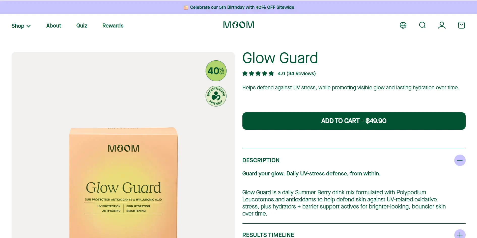
Moom Health’s product pages are some of the most comprehensive we’ve seen so far. Everything from different flavours, results timeline, how-to-use, formulas & feature cards are all included.
View Moom Health’s product pages
Mister Mobile
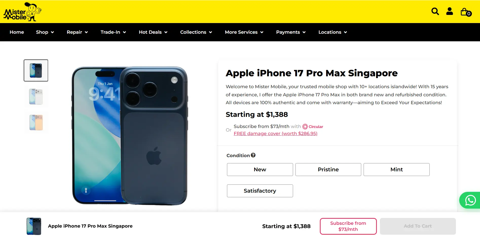
Apart from a wide range of purchase options, Mister Mobile’s product pages cover everything from the key information, shop locations & how the purchase service works, leaving little room for doubt.
View Mister Mobile’s product pages
Dilmah Tea
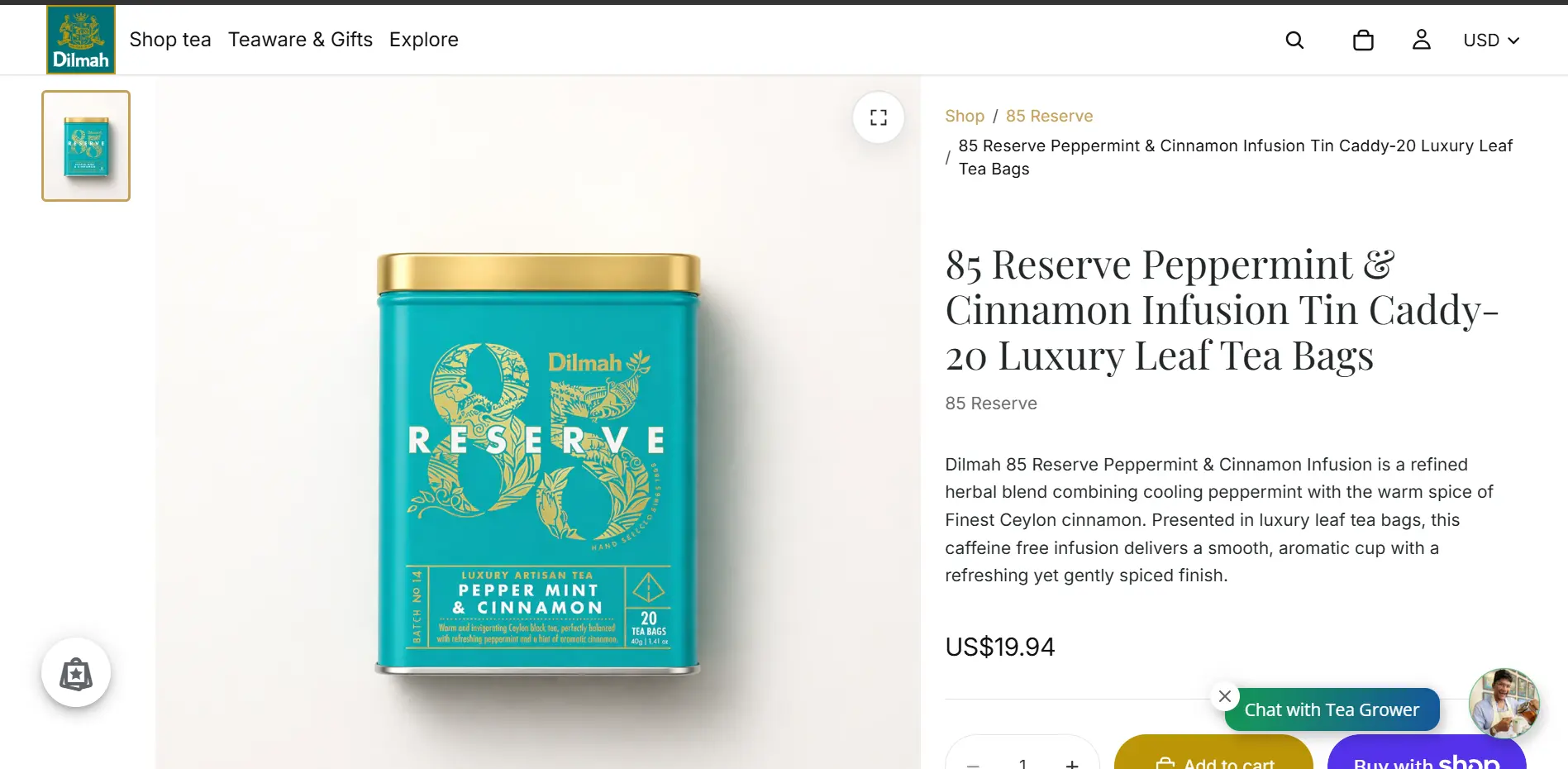
A great example of modern story-telling with highly descriptive content, brewing guides & storylines embedded on the product page.
Optimize your Product Page for Digital Success
Product pages are the final & arguably most important step in moving customers forward in the purchase process, & driving business ROI.
They’re essentially the meeting point of everything else you’ve invested in; your branding, your marketing, your traffic. No matter how strong your campaigns are, a weak product page is where that effort quietly falls apart.
Make sure you’re paying close attention to this funnel, & always aim to iterate and optimize it for better performance.
Summary
For pure eCommerce functionality, Shopify is king. Pair it with apps like GemPages, Shogun, or PageFly to get complete drag-and-drop control to build highly custom, conversion-optimized product pages without writing code. Also, WordPress paired with WooCommerce and a builder like Elementor or Bricks is incredibly powerful. It requires more maintenance but has zero design limitations.
For a standard, high-converting long-form product page, the sweet spot is usually 5 to 7 key segments. Splitting it up into clear blocks keeps the page scannable.
Product pages are an essential pillar of an eCommerce SEO strategy. While category pages target broad search terms, product pages are great for capturing high-intent, ready-to-buy traffic looking for specific items.
At dantiv, we are an all-in-one eCommerce & web design agency serving SMEs in Singapore & the region. Utilizing our experience in building hundreds of eCommerce stores, we craft & optimize bespoke product pages for every industry & product type to ensure your success.